Charts in lists
In lists in Monitor ERP you can display charts presenting values from the list. You view the chart and make settings for it using the Chart button  on the function menu.

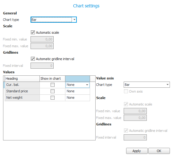
Settings possible to make for the chart concern chart type, scale, gridlines, and which values to show.
There are a number of different chart types to select among. You can configure if there should be an automatic scale or you can enter a fixed minimum and maximum value of the scale. You can also decide if there should be an automatic gridline interval or you can enter a fixed interval.
The values you can select to show are columns in the list which contain numerical values. You can decide if an aggregation should be made of a value. For each value you can choose to display a separate value axis (y-axis) in the chart. The settings for the value axis such as chart type, scale, and gridlines, are automatically set to the same as the corresponding general settings.
The category axis (the x-axis) always shows the value which the list is grouped by.
When you approve the settings with the Apply button or when you close the editing window by clicking OK the tab becomes divided in two sections. The chart is then shown in the bottom section and the list is shown in the top section. It is possible for you to increase/decrease the height of the sections by dragging the frame with your mouse pointer.
In certain lists a chart is shown from the start, for example in the total list for invoice bases.
For the chart to be shown you have to have selected at least one value in the chart settings.


