Settings (Business intelligence – BI)
Under Settings in the backstage of the procedure you can create own (custom) views for the BI that is built into Monitor ERP. This function is available in the procedures BI – Sales and BI – Purchase. You only access these settings in the backstage of the procedure to create own views if you have permission to via your user rights in yous user account. Otherwise these settings are not visible.

Getting started with Business Intelligence (BI)
Go to the Settings for BI procedure to determine the companies in the system from which data such as purchase statistics, sales statistics, and order inflow, should be loaded. You also decide how often this should be done.
When activating the Use alias when exporting to Business intelligence system setting, the "Alias for BI" field becomes available in various procedures. This is done in order to determine what the data mining data should extract to the BI and if different records should be aggregated in the BI.
Settings in the backstage of the procedure
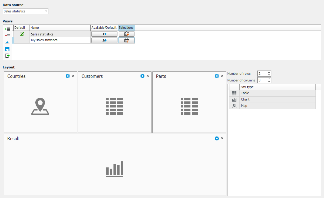
Here you select the Data source on which you want to base your own view. The data sources you can select among are the ones included in the system. In future versions of MONITOR more data sources might be added.
In the Views table you see the views that are included as standard for the selected data source. This is where you add new own views. A new view can either be created as an empty view by using the button Add new row at the end  or as a copy of an existing view using the button Copy view
  .
.
Available/Default
In the Default column you see which view is default for you as user of the data source in question. By clicking the button Available/Default  you access settings where you determine for which users or all users that the view should be default. There you also configure for which users that a view should be available.
Selections
Under the Selections button  you can create a default selection for the view. The user will then be able to modify or temporarily delete this selection under the corresponding button on the toolbar in the procedure. Check the Locked checkbox for the selection rows which should not be possible to change or delete in the view.
For an own view you can enter how many Rows and Columns you want the view to have. You can drag a box type from the table to the right and drop it on the grid. This works in the same way as when configuring the Desktop.
You can change the width of a box by dragging the edge of it to make it cover two or more columns. In the example in the image above, the box on the bottom row stretches over all three columns.
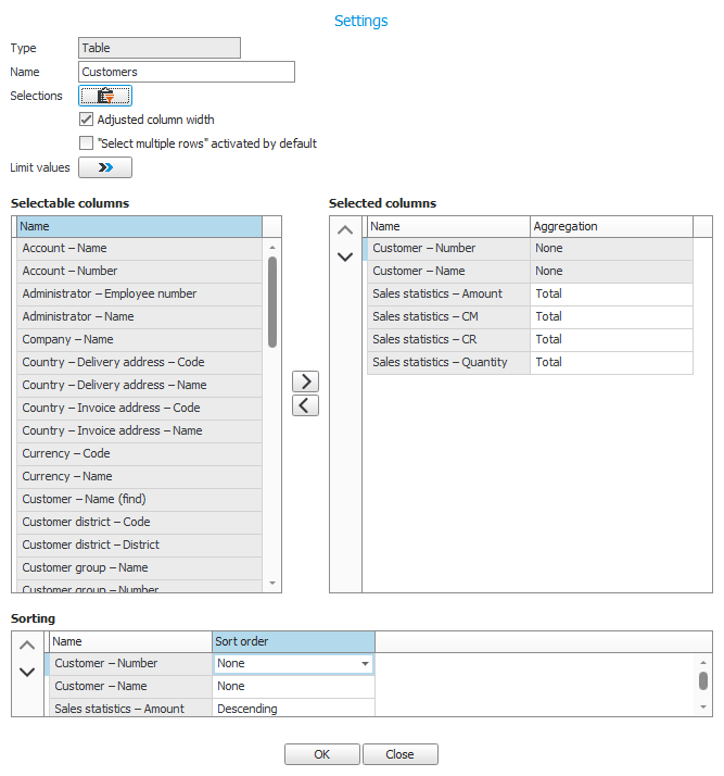
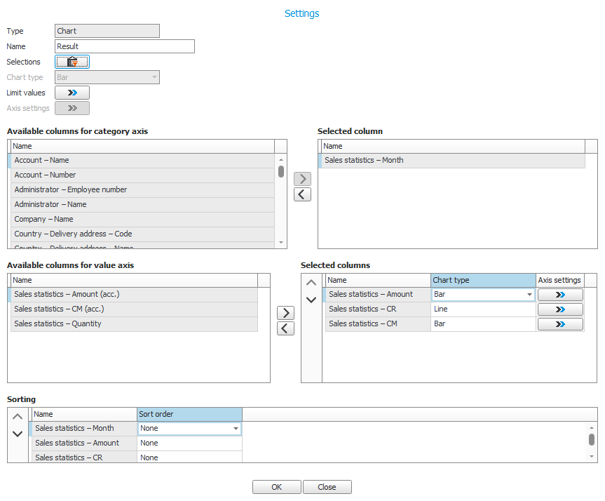
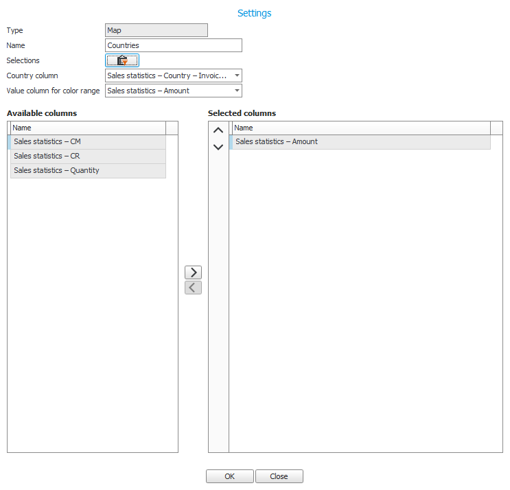
Using the Box settings button  you can in each box configure what it should show. There are three types of components: Table, Chart, and Map. Depending on which component type you select, different box settings are available.
Selections
One thing which apply for all components is that you by using the Selections button  can choose to show a selection of records.
Limit values
Here you decide how the shown values will be limited in tables and charts. You can enter a quantity which should be shown of the greatest or lowest values. You can also filter by percent and choose to show values which are at most/at least the entered percentage of the total.
Adjusted column width
If you activate this setting it means the width of all columns will become adjusted to fit the box.
"Select multiple rows" activated by default
With this setting you decide if the function Select multiple rows should be activated by default in the table.
Columns
You select which columns you want to include in the table. You can select aggregation as sum or an average value for each column. A sum or an average value is then shown below the column.
Sorting
You can select a default sorting for each selected column.

Chart type
You can choose between the chart types bar, line, circle, and area.
Axis settings
By clicking the button Axis settings  you access general settings for the axes in the chart. By activating the setting Automatic scale, an automatic scale will be applied to the chart. If you do not check this checkbox you can enter fixed minimum and maximum values for the scale. With the setting called Automatic gridline interval you decide if you want to get an automatic division of the chart by gridlines. If you do not activate this setting you can enter a fixed interval instead.
Columns
You select a column to show on the category axis (x-axis) and which columns to show on the value axis (y-axis). You can for each column on the value axis select Chart type and by clicking the button Axis settings  you can select if it should be an Own axis in the chart. If so, you can change axis settings as stated above, but here you do it specifically for the selected column.
Sorting
You can configure a default sorting for each selected column.

Country column
Here you select how statistics per country should be displayed. You can select via Mailing address for purchase statistics and Invoice address or Delivery address for sales statistics.
Value column for color range
Here you configure which value column the color range should be based on, when comparing countries. The selected column is moved to Selected columns in the table below.
Columns
Here you can add the rest of the columns which should display data in the map. This is shown in a tooltip when you hover the mouse pointer over each country in the map.

Using the Save button  you save a view which you have created or modified.
Using the Export button  you can export the selected view to a Json file. This can be useful if you experience problems with a view you have created and need to contact the Support Center. This exported file can then be sent to Monitor ERP System AB for troubleshooting .


